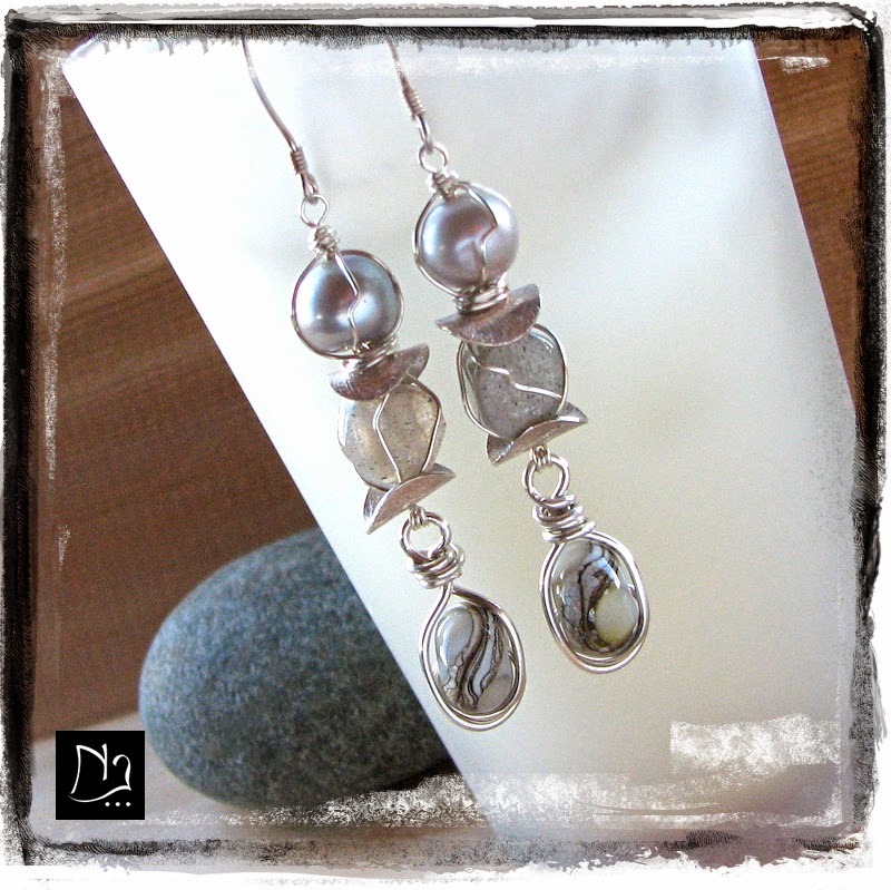
I've accumulated an extensive stash of fresh water pearls over the years. I hoard them.
I really think I need an intervention group or something for my bead-hoarding...
(but I'm guessing that we'd all end up participating in the group lol)
The other day, when Miss Erin showcased the new 2015 Pantone colors, I started looking through my stash and pulled out a couple of strands of pearls that caught my eye with their soft cool hues.
They seemed to match really well with this year's palette.
They seemed to match really well with this year's palette.
When I use pearls in my designs, I aim to set them up in a non-traditional way, so that we don't end up thinking that we're wearing our grandma's pearls ;)
So this is what I've come up with for this design:
 |
| Designer Pearl Earrings by Nathalie Lesage at NatLJ.com |
The fresh water pearls featured at the top are a soft cool blue, almost a dusk blue (Pantone 16-4120). Although the color is soft, I think these two pearls at the top really 'pop' and add a touch of brightness and spunk to the design. They seem almost luminescent :)
The set of pearls at the bottom is a Titanium grey (Pantone 17-4014) that picks up
the same metalic hues as the Hill Tribe Fine Silver Squares.
 |
| Soft cool grey hues inspired by the Pantone 2015 colors |
These hollow HT square were very plain originally, but a few years ago, I had heavily distressed them to use them in a project, and I ended up using something else instead. I kept wanting to do something with these, and it seems that today was the right moment.
I hope that you'll agree that these are not your grandma's pearls :D
Have a fabulous day!
Nathalie
Metalsmith & Jewelry Artist